


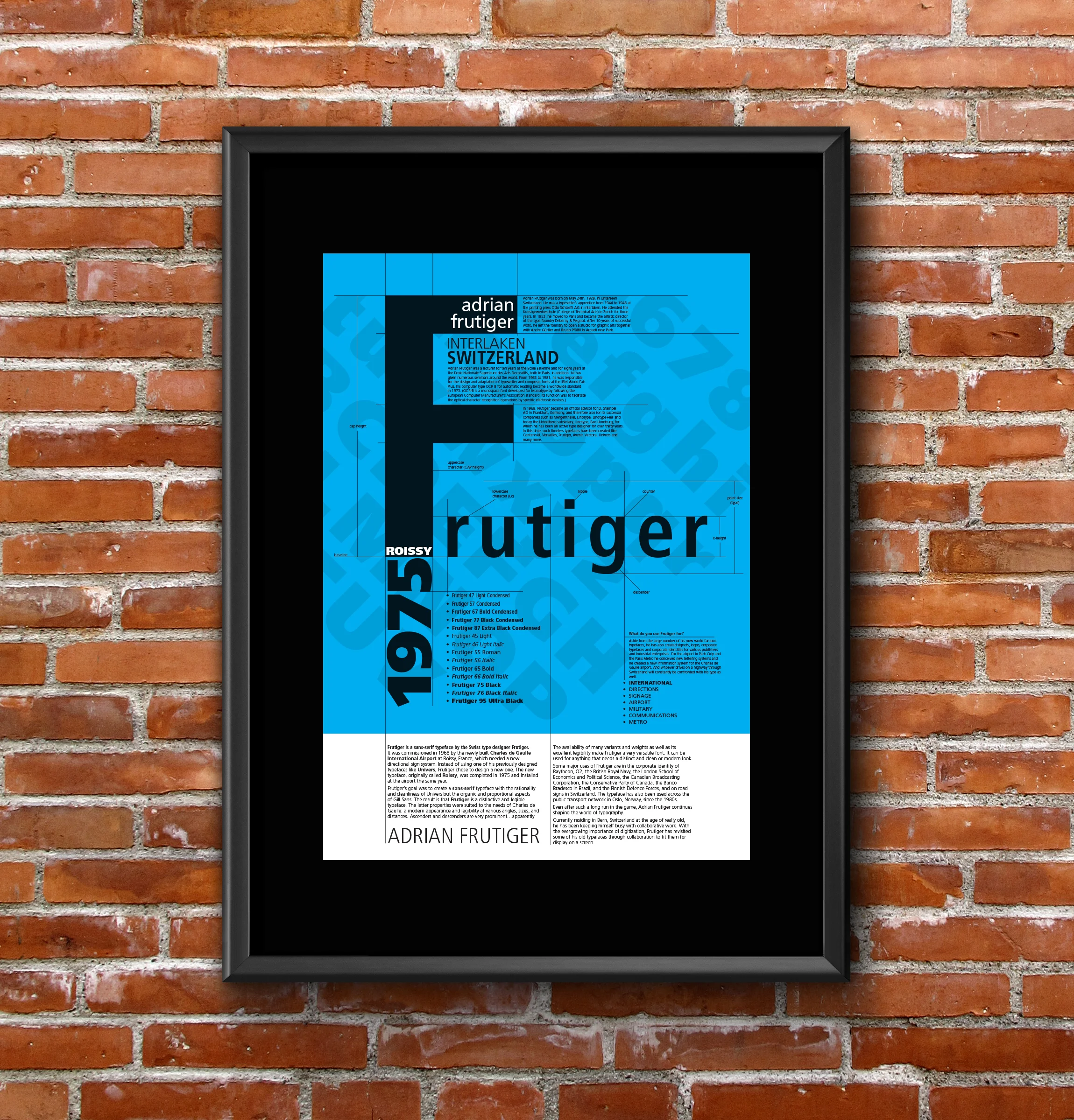
Adrian Frutiger
Adrian Frutiger was born on May 24th, 1928, in Unterseen Switzerland. He was a typesetter’s apprentice from 1944 to 1948 at the printing press Otto Schlaefli AG in Interlaken. He attended the Kunstgewerbeschule (College of Technical Arts) in Zurich for three years. In 1952, he moved to Paris and became the artistic director of the type foundry Deberny & Peignot. After 10 years of successful work, he left the foundry to open a studio for graphic arts together with Andre Gürtler and Bruno Pfäffli in Arcueil near Paris.
Aside from the large number of his now world famous typefaces, he has also created signets, logos, corporate typefaces and corporate identities for various publishers and industrial enterprises. For the airport in Paris Orly and the Paris Metro he conceived new lettering systems and he created a new information system for the Charles de Gaulle airport. And whoever drives on a highway through Switzerland will constantly be confronted with his type as well.
Adrian Frutiger was a lecturer for ten years at the Ecole Estienne and for eight years at the Ecole Nationale Superieure des Arts Decoratifs, both in Paris. In addition, he has given numerous seminars around the world. From 1963 to 1981, he was responsible for the design and adaptation of typewriter and composer fonts at the IBM World Fair. Plus, his computer type OCR B for automatic reading became a worldwide standard in 1973. (OCR-B is a monospace font developed for Monotype by following the European Computer Manufacturer's Association standard. Its function was to facilitate the optical character recognition operations by specific electronic devices.)
In 1968, Frutiger became an official advisor for D. Stempel AG in Frankfurt, Germany, and therefore also for its successor companies such as Mergenthaler, Linotype, Linotype-Hell and today the Heidelberg subsidiary, Linotype, Bad Homburg, for which he has been an active type designer for over thirty years. In this time, such timeless typefaces have been created like Centennial, Versailles, Frutiger, Avenir, Vectora, Univers and many more.
Frutiger
Frutiger is a sans-serif typeface by the Swiss type designer Frutiger. It was commissioned in 1968 by the newly built Charles de Gaulle International Airport at Roissy, France, which needed a new directional sign system. Instead of using one of his previously designed typefaces like Univers, Frutiger chose to design a new one. The new typeface, originally called Roissy, was completed in 1975 and installed at the airport the same year.
Frutiger's goal was to create a sans-serif typeface with the rationality and cleanliness of Univers but the organic and proportional aspects of Gill Sans. The result is that Frutiger is a distinctive and legible typeface. The letter properties were suited to the needs of Charles de Gaulle: a modern appearance and legibility at various angles, sizes, and distances. Ascenders and descenders are very prominent…..apparently
What do you use Frutiger for?
The availability of many variants and weights as well as its excellent legibility make Frutiger a very versatile font. It can be used for anything that needs a distinct and clean or modern look.
Some major uses of Frutiger are in the corporate identity of Raytheon, O2, the British Royal Navy, the London School of Economics and Political Science, the Canadian Broadcasting Corporation, the Conservative Party of Canada, the Banco Bradesco in Brazil, and the Finnish Defence Forces, and on road signs in Switzerland. The typeface has also been used across the public transport network in Oslo, Norway, since the 1980s.
Even after such a long run in the game, Adrian Frutiger continues shaping the world of typography.
Currently residing in Bern, Switzerland at the age of really old, he has been keeping himself busy with collaborative work. With the evergrowing importance of digitization, Frutiger has revisited some of his old typefaces through collaboration to fit them for display on a screen.